About a year ago, I was back home in Santiago and I was working on a painting project. I visited multiple art stores and I discovered KRACK acrylic paints. They are a Chilean brand of paints and I fell in love with the brand. First of all, they have a unique color palette and the colors are named after cultural references, such as foods like merken (an orange red chili pepper), helado de piña (a creamy yellow pineapple sorbet), etc. I also love their pigment quality and I am gushing over the brightness of the colors.
Ponle color po Project:
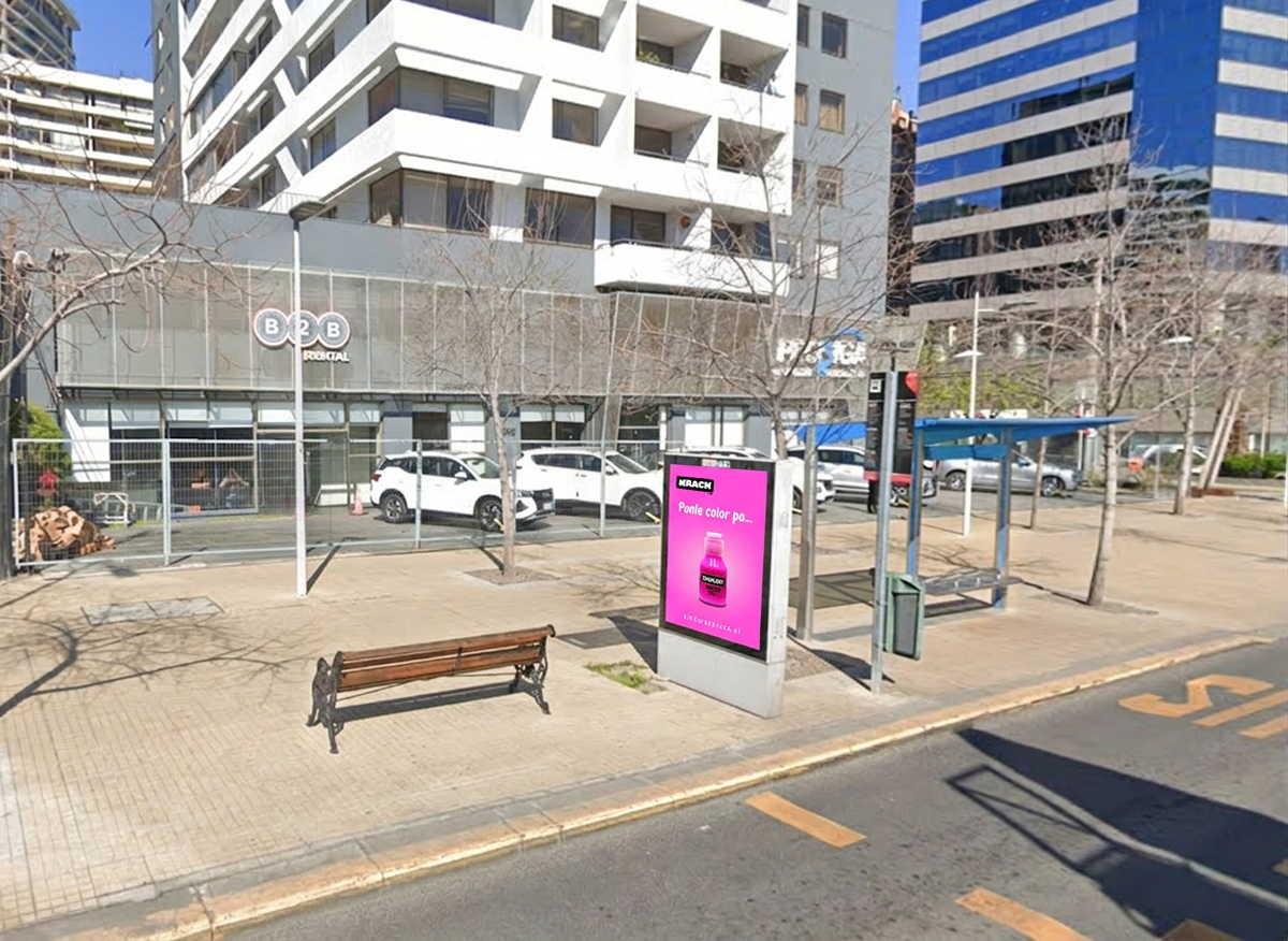
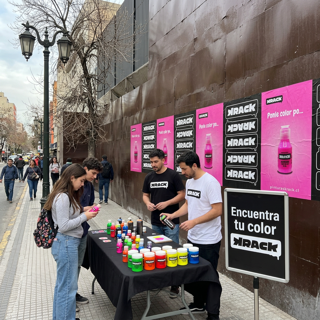
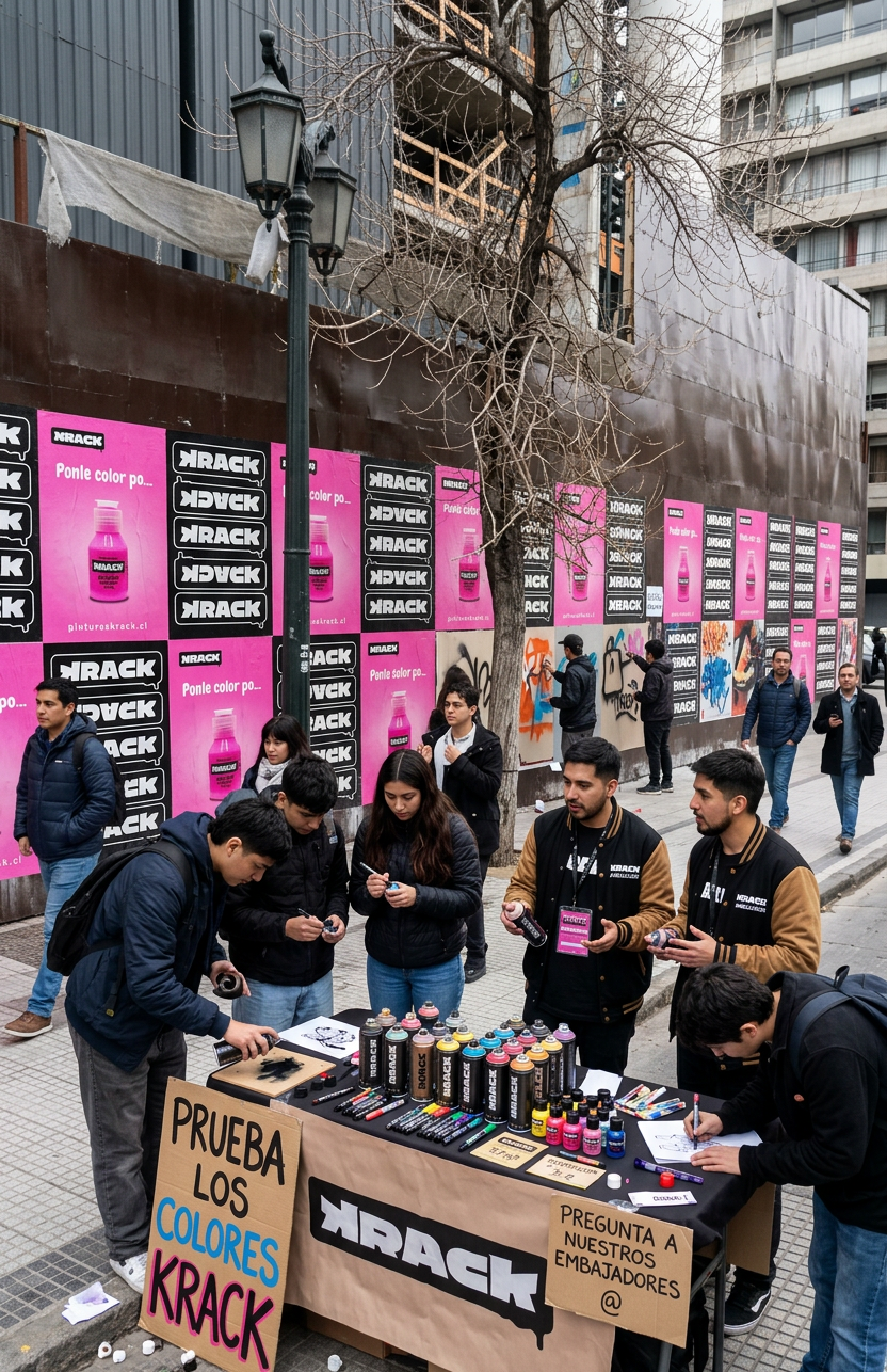
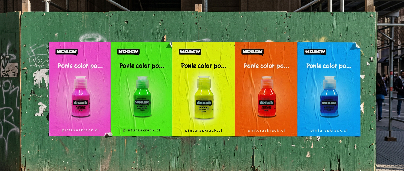
Ponle color means to put color on something, but also the idiom means to make a big deal out of something, so in this case the phrasing makes sense culturally in both ways.
I got inspired by the brand, the pigment quality and the urban landscapes of Santiago to create a poster that could be part of a marketing campaign to bring brand awareness to all kinds of painters besides street artists, since they have a variety of products that include indoor painting. Also, the idea of the campaign would be to include an outdoor activation where passers can test the products and put a little bit of color to the city. It is known in Chile that Santiago is a grey city, so the idea of the activation would be to test products, test new potential products and most importantly: put some color on the walls (ponerle color)!
The images of this campaign were developed using Firefly AI and the posters were made using Adobe Illustrator.